Heatmaps vs. Timelines for Patent Trends
Intellectual Property Management
Apr 6, 2026
Compare heatmaps and timelines to understand where and when patent activity clusters, and how to use each for IP strategy.

Patent data is overwhelming, with over 3.5 million filings annually. To make sense of this, two tools stand out: heatmaps and timelines. Heatmaps focus on where innovation happens, using color gradients to highlight competitive areas ("hot zones") and untapped opportunities ("white spaces"). Timelines, on the other hand, track when innovation occurs, revealing technology lifecycles from inception to maturity.
Key Takeaways:
Heatmaps: Best for spotting competitive clusters, identifying gaps, and analyzing geographic or sector-specific trends with AI-enabled patent analysis.
Timelines: Ideal for tracking growth rates, understanding technology lifecycles, and timing market entry.
Together, these tools provide a complete view of patent trends, helping businesses make better R&D and market strategy decisions. While heatmaps show spatial density, timelines highlight temporal shifts. Both require clean, normalized patent data for accurate insights.
Using Patent Analytics Dashboards for IP Strategy, Competitor Surveillance, and Portfolio Management
What Are Heatmaps for Patent Trends?
Heatmaps play a key role in making patent trends easier to understand by turning raw data into a visual format. Think of them as grids filled with colors, where each shade represents the level of activity in a particular area. Warm colors like red and orange signal heavy patent filings, while cooler tones like blue and green point to less activity. This visual approach helps uncover patterns in massive datasets - like the 3.5 million patents filed globally each year - at a glance.
The way heatmaps work is straightforward. They map categories, such as technology types or company names, across horizontal and vertical axes. This setup is especially useful for identifying trends or gaps in innovation. For instance, a solar startup in September 2025 used heatmaps to spot an underdeveloped area in flexible solar panels. By focusing on this "white space", they avoided patent conflicts and gained a first-mover edge.
"Patent heat map tools are not just tools; they're your eyes in the sky, giving you a bird's-eye view of the landscape. They illuminate the paths taken by competitors, highlight the areas of dense innovation, and reveal the zones ripe for your own exploration." - PatentPC
The top patent tools have taken heatmaps to the next level. AI-powered systems now group patents into semantic clusters, revealing hidden connections between technologies. This advancement can cut down analysis time by up to 70%, making it easier to pinpoint opportunities and threats in the competitive landscape.
Key Features of Heatmaps
One standout feature of heatmaps is their use of a color gradient. This system transforms numbers - like patent counts or filing frequencies - into a visual spectrum, making it easier for the human eye to detect trends instantly. Unlike rows of numbers in a table, heatmaps simplify complex data into something you can grasp at a glance.
Another advantage is their ability to handle multiple variables at once. For example, heatmaps can show which companies dominate specific technologies, compare innovation levels across regions, or highlight overlaps between technical fields. This multi-layered approach ensures both competitive hotspots and unexplored opportunities are easy to spot. Advanced platforms even clean up data inconsistencies, like variations in company name spellings, to ensure accuracy.
Heatmaps also excel at identifying two critical areas: hotspots and white spaces. Hotspots, marked by clusters of intense color, show where innovation is thriving and competition is fierce. On the other hand, white spaces - areas with little to no color - indicate untapped potential that could be worth exploring. Some tools go further by organizing data into hierarchical clusters, revealing relationships between technologies and uncovering trends that might lead to cross-licensing opportunities.
Benefits of Heatmaps
The biggest advantage of heatmaps is how they make complex data accessible. Instead of wading through spreadsheets or lengthy reports, decision-makers can quickly grasp trends and competitive positioning through a visual summary. This is why over 70% of large companies now use heatmaps as part of their R&D and market strategy planning.
Heatmaps also shine in competitive analysis. They highlight areas where competition is intense and identify white spaces that represent opportunities for innovation. This insight helps businesses decide where to focus their R&D efforts while steering clear of crowded fields with high litigation risks.
Beyond competition, heatmaps aid in broader strategic planning. They can guide SWOT analyses, inform mergers and acquisitions, and even identify licensing opportunities. For example, Google's $3.2 billion acquisition of Nest in 2014 was partially influenced by an analysis of Nest's strong intellectual property portfolio.
Drawbacks of Heatmaps
Despite their strengths, heatmaps have some limitations. One major drawback is their inability to show how trends evolve over time. While they excel at providing a snapshot of current activity, they struggle to capture the dynamic lifecycle of patents, from early surges to eventual maturity. To get a more complete picture, additional tools like timelines or trend graphs are often needed.
Another issue is precision. While heatmaps are great for high-level insights, they fall short when exact numbers are required. For instance, distinguishing between 47 and 53 patents based on color alone can be tricky without a clear legend or interactive features.
Lastly, the effectiveness of heatmaps depends heavily on clean, normalized data. Variations in company names or technology classifications can lead to misleading results, creating false hotspots or hiding genuine opportunities. Rigorous data cleaning is essential to avoid these pitfalls.
What Are Timelines for Patent Trends?
Timelines provide a way to track when innovations occur, complementing the where insights offered by heatmaps. These visual tools, such as line graphs and trend charts, plot patent data over time, capturing key dates like filings, publications, and grants. By doing so, they reveal how patent activity evolves over months, years, or even decades, offering a chronological perspective that enriches spatial analyses from heatmaps.
These graphs showcase the lifecycle of a technology - its inception, growth, maturity, and eventual decline. For instance, a timeline for AI medical imaging patents might show a slow start in the early 2010s, a sharp rise between 2018 and 2022, and a leveling off as the field matures. This type of insight not only complements heatmap data but also helps guide research and development decisions at the right time.
Timelines are also crucial for spotting inflection points, which mark shifts between lifecycle phases. Identifying these moments early can help businesses strategically time their R&D investments and patent filings, ensuring they enter a field before competition becomes overwhelming. Additionally, periods of low patent activity can highlight untapped opportunities for innovation.
Modern AI-enabled patent platforms leverage AI to automatically generate these timelines, making it easier to detect key transitions and inflection points among the 3.5 million patents filed globally each year.
Key Features of Timelines
The main strength of timelines lies in their ability to display chronological trends. By plotting patent filings along a time axis, they make it easy to identify fluctuations in activity. For example, clusters of filings around a specific application can signal the emergence of a new technology worth monitoring.
Another essential feature is peak identification. Spikes in patent filings often indicate that a technology is entering a growth phase or becoming saturated with competitors.
Timelines also track prosecution milestones for individual patents or entire portfolios. These milestones include legal events like publication (usually 18 months post-filing), First Office Action (averaging 22 months for USPTO cases), and Notice of Allowance. Under the standard USPTO process, the time from filing to patent grant typically ranges from 18 to 36 months, though Track One prioritized examination can shorten this to 12–18 months.
Benefits of Timelines
Timelines offer clear insights into growth rates, helping organizations determine whether a technology is accelerating, plateauing, or declining. This is particularly useful for forecasting trends and deciding when to allocate resources. Over the past decade, patent filings have increased by more than 50%, largely driven by advancements in AI and biotechnology.
They are also invaluable for understanding technology lifecycles. By mapping a technology’s progression from inception to maturity, timelines help businesses anticipate market shifts and avoid investing in areas that are already saturated. This lifecycle awareness ensures that intellectual property strategies align with broader business goals.
"Understanding these timelines enables better coordination between patent prosecution and business milestones, ensuring your intellectual property strategy supports rather than hinders your startup's growth trajectory." - Christopher Palermo, Partner, Baker Botts
Additionally, timelines facilitate gap analysis, helping companies identify the ideal time to enter a market. By pinpointing moments when demand is growing but competition remains manageable, businesses can launch products at the right time. In fast-evolving fields like AI and biotech, patent landscape studies are now updated every six months to keep pace with rapid innovation.
Drawbacks of Timelines
Despite their many advantages, timelines have limitations. One key drawback is their inability to analyze multi-dimensional data effectively. While they excel at showing trends over time, they struggle to incorporate additional variables, such as which companies lead in specific technologies or how innovation varies by region. For these insights, heatmaps or other visualization tools are more effective.
Timelines also provide limited insights into spatial trends. They can reveal when patents were filed but not where innovation is concentrated geographically or which technical fields are most active. As a result, they are less useful for identifying competitive hotspots or regional innovation clusters.
Finally, the accuracy of timeline insights depends heavily on having clean and consistent data. Errors or inconsistencies in jurisdiction details or filing dates can skew the analysis, leading to false inflection points or missed opportunities. To avoid these issues, rigorous data normalization is essential.
Heatmaps vs. Timelines: Side-by-Side Comparison
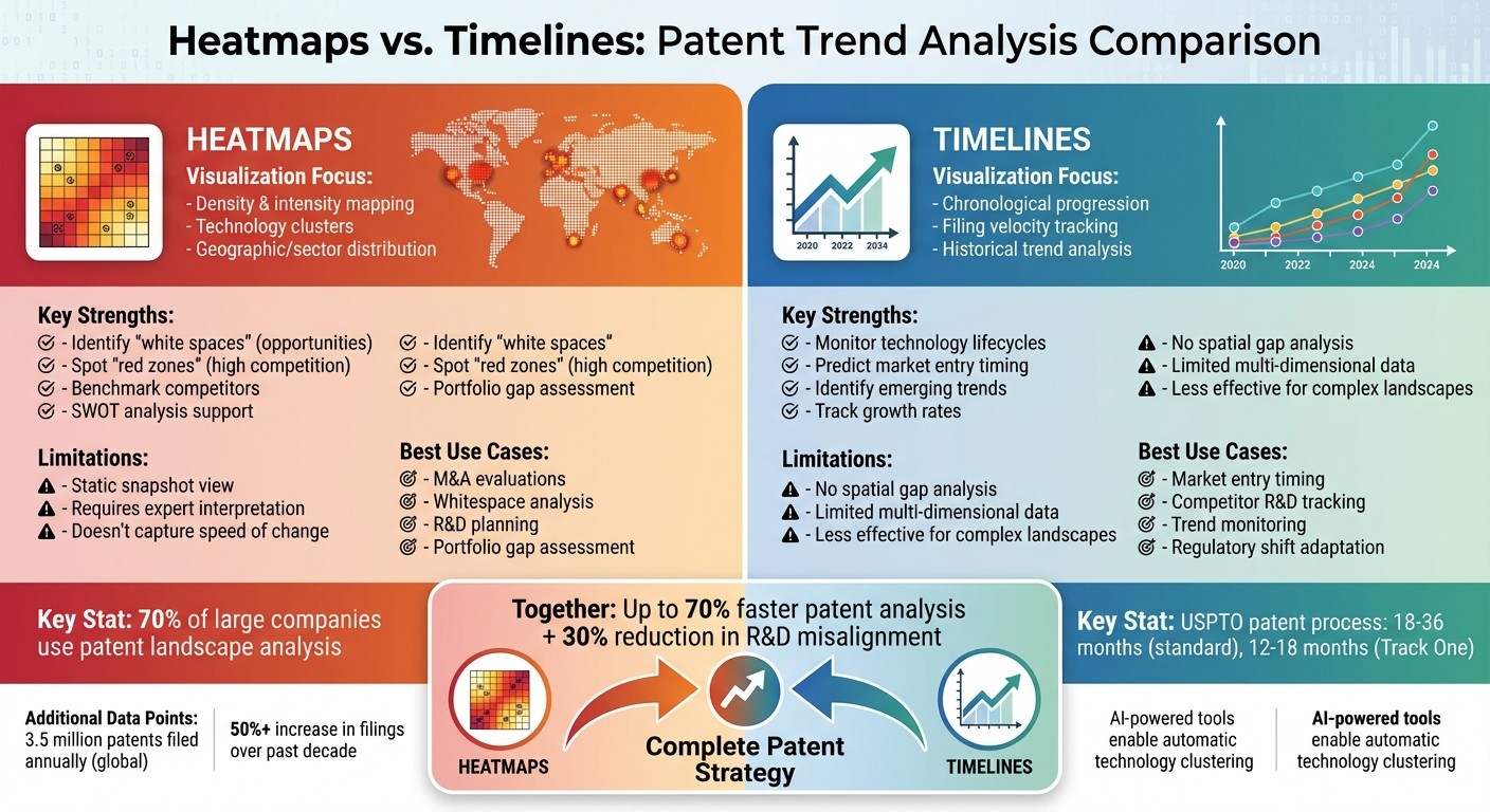
Heatmaps vs Timelines for Patent Analysis: Feature Comparison Chart
After exploring heatmaps and timelines individually, it’s time to put them head-to-head in the context of patent strategy. These tools serve different purposes: heatmaps focus on the where by showing the spatial density of patent filings, while timelines concentrate on the when by illustrating their chronological development. Heatmaps use color gradients - ranging from cool blues to fiery reds - to highlight competitive "hot zones" and untapped "white spaces" in sectors, regions, or technology clusters. On the other hand, timelines reveal the tempo of innovation, helping to track the pace and timing of filings.
The strategic advantages of each are distinct. Heatmaps offer a high-level view of the competitive landscape, making it easier to spot gaps in portfolios or benchmark competitors. Timelines, however, help identify where a technology stands in its lifecycle - whether it’s emerging, growing, maturing, or declining - allowing businesses to time their market entry effectively. Together, these tools provide complementary insights into both the spatial and temporal dimensions of patent analysis.
"Patent heat maps play the role of the music conductor in this dance, providing the rhythm and tempo through visual cues that indicate when it's time to step forward or pause." - PatentPC
Interestingly, modern visualization tools can cut patent analysis time by up to 70%, thanks to features like automatic technology clustering. However, both methods rely heavily on clean data, as even small inconsistencies - like a 15% variation in assignee name spellings - can skew results.
Comparison Table
Here’s a quick breakdown of how heatmaps and timelines stack up:
Feature | Heatmaps | Timelines |
|---|---|---|
Visualization Focus | Highlights density, intensity, and technology clusters across sectors or geographies. | Tracks chronological progression, filing velocity, and historical trends. |
Strengths | Spotting "white spaces" (opportunities) and "red zones" (competitive areas); benchmarking competitors; conducting SWOT analyses. | Monitoring technology lifecycles; predicting market entry timing; identifying emerging trends. |
Limitations | Requires expert interpretation; offers a static view that may not capture the speed of change or specific innovation dates. | Doesn’t show spatial gaps or overlaps; less effective for analyzing complex, multi-sector landscapes. |
Best Use Cases | M&A evaluations, whitespace analysis, R&D planning, and portfolio gap assessments. | Timing market entry, tracking competitor R&D strategies, monitoring trends, and adapting to regulatory shifts. |
When to Use Heatmaps vs. Timelines
Deciding between heatmaps and timelines depends on the specific insights you're looking to gain. Heatmaps are perfect for visualizing the competitive landscape and spotting untapped areas within patent data. They provide a high-level snapshot, highlighting regions - often called "red zones" - where patent activity is concentrated and competition is fierce. For instance, when evaluating patent portfolios, heatmaps can show whether you're ahead of the competition or falling behind. They also support SWOT analyses by revealing both opportunities and potential threats.
On the other hand, timelines are better suited for understanding how technology evolves over time and predicting regulatory shifts. By identifying key turning points - such as when a technology moves from its early stages to growth or from maturity to decline - timelines help you determine the right time to enter a market or adjust your innovation strategy.
Interestingly, more than 70% of large companies now use patent landscape analyses as a critical part of their R&D planning and market entry strategies. In essence, if you're looking to uncover where innovation opportunities lie, heatmaps are your go-to tool. If you're trying to figure out when to act on emerging technology trends, timelines are the better choice.
Combining Heatmaps and Timelines
Using both heatmaps and timelines together provides a comprehensive perspective, blending spatial insights with temporal trends. While heatmaps show the current distribution of patent activity across different technology areas, timelines highlight how these trends shift over time. When combined, these tools can help you make well-informed decisions about your next strategic move.
Conclusion
Pick your visualization tool based on what you’re trying to achieve. Heatmaps are perfect for uncovering spatial relationships - showing where competition is concentrated and where there’s room to explore. They simplify complex data into visual grids of colors, quickly highlighting "white spaces" and "red zones." On the flip side, timelines shine when it comes to temporal patterns. They help you track how technologies evolve, identify shifts in filing momentum, and determine whether a field is growing or nearing maturity.
Combining both heatmaps and timelines can give you a fuller understanding of patent trends. Heatmaps show where opportunities and competition exist, while timelines reveal when to act. Together, they provide a well-rounded view of the patent landscape, potentially cutting R&D misalignment by up to 30%, according to recent data.
Before diving into visualizations, take time to define your focus. Narrow down your technology domain and ensure your patent data is normalized. Whether you’re analyzing competitors, planning R&D investments, or choosing the best time to enter a market, clarity on your objective will shape the insights you gain from heatmaps and timelines.
Interestingly, over 70% of large companies now rely on patent landscape analyses to inform strategic decisions. However, the real value lies in ensuring that every visual cue - whether a cluster on a heatmap or a bar on a timeline - directly supports your business goals. A "hot zone" on a heatmap is meaningless unless it ties back to your revenue or innovation strategy.
FAQs
What data should I clean before using patent heatmaps or timelines?
To get reliable results from patent heatmaps or timelines, start by cleaning your data. Remove duplicates and fix any errors to avoid skewed visualizations or incorrect conclusions. Also, ensure your dataset is consistently formatted and complete - this step is key to creating dependable and accurate visual representations.
How do I choose the right time range for a patent timeline?
Choosing the right time range for analysis depends heavily on your goals. If you're in the early stages, shorter time frames are ideal for tracking invention disclosures or new filings. As you progress, longer periods might be more useful for observing patent family developments or monitoring legal events. Make sure your timeline aligns with your objectives - whether it's prosecution, portfolio management, or competitive analysis - so you can effectively focus on trends or the evolution of technology during the relevant periods.
How can I combine a heatmap and timeline to guide R&D decisions?
Combining a heatmap with a timeline offers a powerful way to understand both the where and when of patent trends. Heatmaps visually pinpoint regions with high or low patent activity, making it easier to spot innovation hubs or areas lacking activity. When paired with a timeline, you can see how these hotspots shift over time - whether certain areas are gaining momentum or fading out.
This method equips R&D teams to focus on areas showing growth, steer clear of declining sectors, and make smarter choices about where to channel resources. It’s about seeing the bigger picture while staying ahead of the curve.